Screens, Research and Hypertext
Powered by 🌱Roam GardenThe Web Is Not for Printing
Why do we saddle a medium that is not made for printing with a set of tools built for printing?
I built my first professional website in 2009. I was both late to the game and a total amateur. Three years prior, I'd been a philosophy professor. In those intervening years, I was a staff writer at FactCheck.org.
I knew nothing about building a website. But I was possessed of two secret weapons.
- A brother who had been working on the web as long as the web had existed.
- The confidence of a mediocre white man.
So I worked with two of my colleagues to re-engineer the entire FactCheck.org website. There was some structure (custom post metadata—ugh). But there was also a lot of hacky code and a big fat WYSIWYG editor.
By the time I was hired to help the U.S. Congressional Budget Office rebuild its website, I had learned about content strategy and attended a full-day workshop with Karen McGrane. There I converted to the Gospel of Structured Content and rejected the heresies of blobby WYSIWYG body fields.
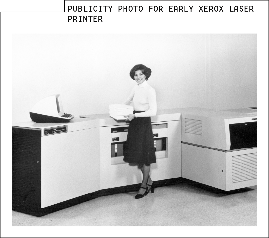
That's where I learned that the WYSIWYG was invented by the team at Xerox's PARC research center. And that by the time of the WYSIWYG, Xerox had already developed the laser printer.

The problem with selling laser printers was that businesses had this great way to print documents, but no real way to create them.
The WYSIWYG was literally invented to sell printers.
The web isn't a document, and it's not made to be printed.
So why do we keep saddling it with tools built for printing?
For more context
The WYSIWYG makes sense when you presume that "research output" and "PDF report" are synonyms.
What to read next
Modern website design conventions really do make reading scholarship on a screen into a dreadful experience.
Other items of interest
What's so great about content strategy?
Nelson is right. The web should be much more than a set of documents with some navigation around them.
Breaking the print paradigm is why this project looks terrible on mobile.
Referenced in
The Artifact and the Garden
But when it comes to putting research online, our systems privilege outcomes over process. We concentrate on documenting new information. Indeed, in many cases, we take document literally, locking our findings into PDFs that are optimized for printing.
Technology Shapes Rhetoric
The make the web like print paradigm is so dominant that it’s tempting to think that writing and writing for books are extensionally equivalent.
Metaphors in Action
Those physical metaphors shape how we write our content, as well. When you open up a Word document, you’re starting with something that looks like a piece of paper. And when you start writing stuff down on that virtual paper, you’re building in all the inherent limitations of print.
Linear Writing
We still write content as if it will go into pages and chapters. We build some internal navigation to guide people to different chapters. We build sophisticated web publishing tools—then saddle them with WYSIWYG editors lifted from word processing programs that are meant to spit out pieces of paper. We drop nice, linear copy into boxes labeled “body,” then demand live previews or inline editing so that we can see how our page is typeset.