Screens, Research and Hypertext
Powered by 🌱Roam GardenScreens and Reading
Think tank websites are optimized for the wrong kind of reading.
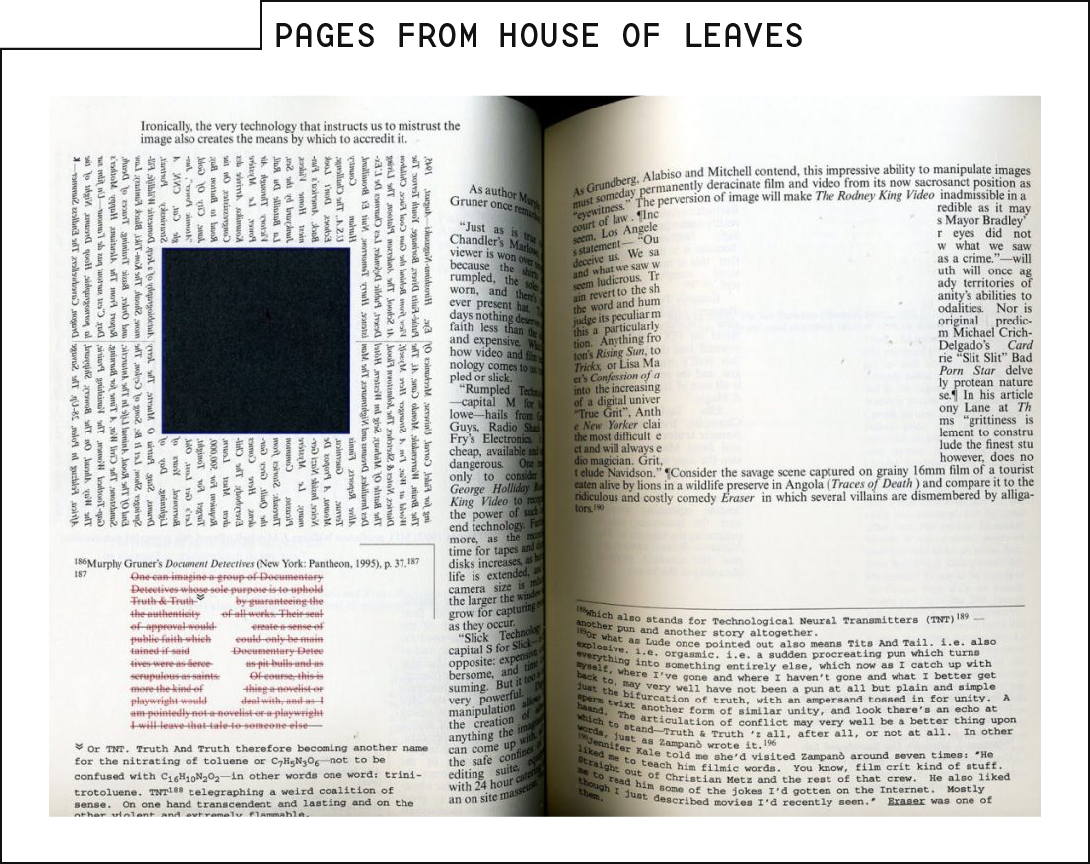
I read a lot of fiction. Most years I average a bit under a novel each week. Over the past few years, I've read nearly all of them on my Kindle. The few exceptions have been books that really only work in print— House of Leaves, Building Stories, Ship of Theseus and the like.

The Kindle is amazing for fiction. Millions of books. Weighs only a few ounces. Easy to flip pages even when you're holding a sandwich. (I'm not sure I remember how to eat lunch without reading.)
I don't think I've read a single nonfiction book on Kindle.
The Kindle is great for reading things where the pages need to be read sequentially. It's why they're great for fiction.
But that's not how I read nonfiction. I flip ahead to sections that interest me. I go back when I realize I didn't fully understand an earlier concept that I need now. Often I open a second or third book to cross-reference what I'm seeing.
John Schwartz talks to clients about "sitting forward" or "sitting back" styles of reading. Media theorist Helen Katz describes those styles thus:
Lean forward, where the reader is actively controlling the flow of information.
*Lean back**, where the reader passively consumes information in a way that the author has directed.
Kindles are optimized for lean-back reading. At their best, the device disappears. Only the story remains.
Nonfiction is normally lean-forward reading. When the reader is in control, sequential ordering makes less sense. Lean-forward readers are drawing connections both within the text and between different texts.
The Kindle just doesn't work well for that. Moving to earlier passages is enough of a pain that I still couldn't tell you off the top of my head how best to do it, for all that I was among the people who ordered a 1st-generation version.
The web is much more capable of nonlinear reading than a Kindle (or print, for that matter). Screens are (usually) bigger. Pages load faster. Hyperlinks are a core feature. And yet, pretty much every website in the research sector is optimized for lean-back reading.
We have a main viewing area, then stuff everything else into sidebars (if you're a bit old fashioned) or into fields that stack above or below the main text. Follow a link and the old text disappears, replaced by a brand new text.
We're more than 30 years into the web, and when it comes to lean-forward reading, it's still objectively worse than my literal, physical desktop. After all, my desk holds multiple texts at once, and holds them in a form that lets me easily flip between sections, interacting with multiple texts in the same context.
On the web, the best case is having two tabs side-by-side, and a bunch of scrolling to find earlier or later passages.
For more context
Very few people read research content on a mobile phone. There's a good reason for that.