Screens, Research and Hypertext
Powered by 🌱Roam GardenStorytelling and the Web
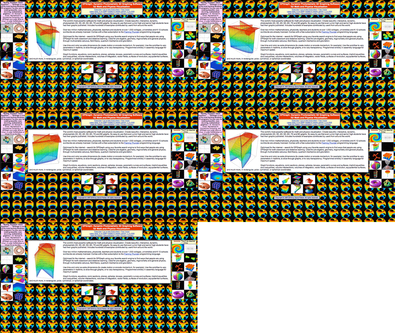
Early websites were equal parts horrifying and amazing.
In the early days of the web, every page was built from scratch. That approach had some virtues. At its best, it resulted in gorgeous, art directed pages in which the design and language combined to enhance meaning. More often, it resulted in dancing babies, flying toasters, and garbage Dreamweaver code.

But the biggest holdup for hand-coded pages is speed. Building each page from scratch is far too slow to support professional publishing.
Enter the CMS. Content started to develop some structure—dates and titles and author names and photos could all be stored as separate fields in a database, then reassembled in the browser where they could be displayed via standardized templates.
But as Jeff Eaton reminds us, structured content has its own challenges:
When narrative text is mixed with embedded media, complex call-outs, or other rich supporting material, structured templates have trouble keeping up.
Authors want control. They want to be able to insert charts and photos and tables in specific places. They want to control the order in which readers see content. Control is why so many authors—particularly those who specialize in longform content—are devoted to their PDFs. Control is why we have body fields with [WYSIWYG(WYSIWYG (defined))] editors. And control can give us beautifully art-directed, prize-winning pieces like the New York Times’ Snow Fall.
Today, tools like Medium, Atavist [Depreciated since this essay was originally published — ed.] and the Gutenberg editor for WordPress make it easier than ever to drop rich content directly into the body of a story. It’s a great solution for authors who want complete control over the appearance of their writing.
It’s a nightmare for things like content reuse, multi-channel publishing, search, or voice-activated assistants.
This tension between structured content and traditional author-directed storytelling is real, but perhaps not insurmountable.
For more context
Traditional storytelling uses space to visualize time.
What to read next
In the early days of the web, everything was curated.
Other items of interest
Think tank CMSs have kinda solved the blobby body field problem. But not very well.
Tell me more about content reuse and multi-channel publishing.
What does curation look like in a modern CMS?
Referenced in
Technology Shapes Rhetoric
The early days of the web were a nightmare of text editors and hardcoded content. (I hate that this sentence reminded me of the existence of Dreamweaver.) Web 2.0 — first blogging tools and later social media — democratized the web, but did so by introducing authoring environments that mimic word processors or lightweight email clients. Tools for writing books or letters.